These graphs are a bit compressed to fit on the paper. The doctor showed me graphs that were much larger, so more detailed.
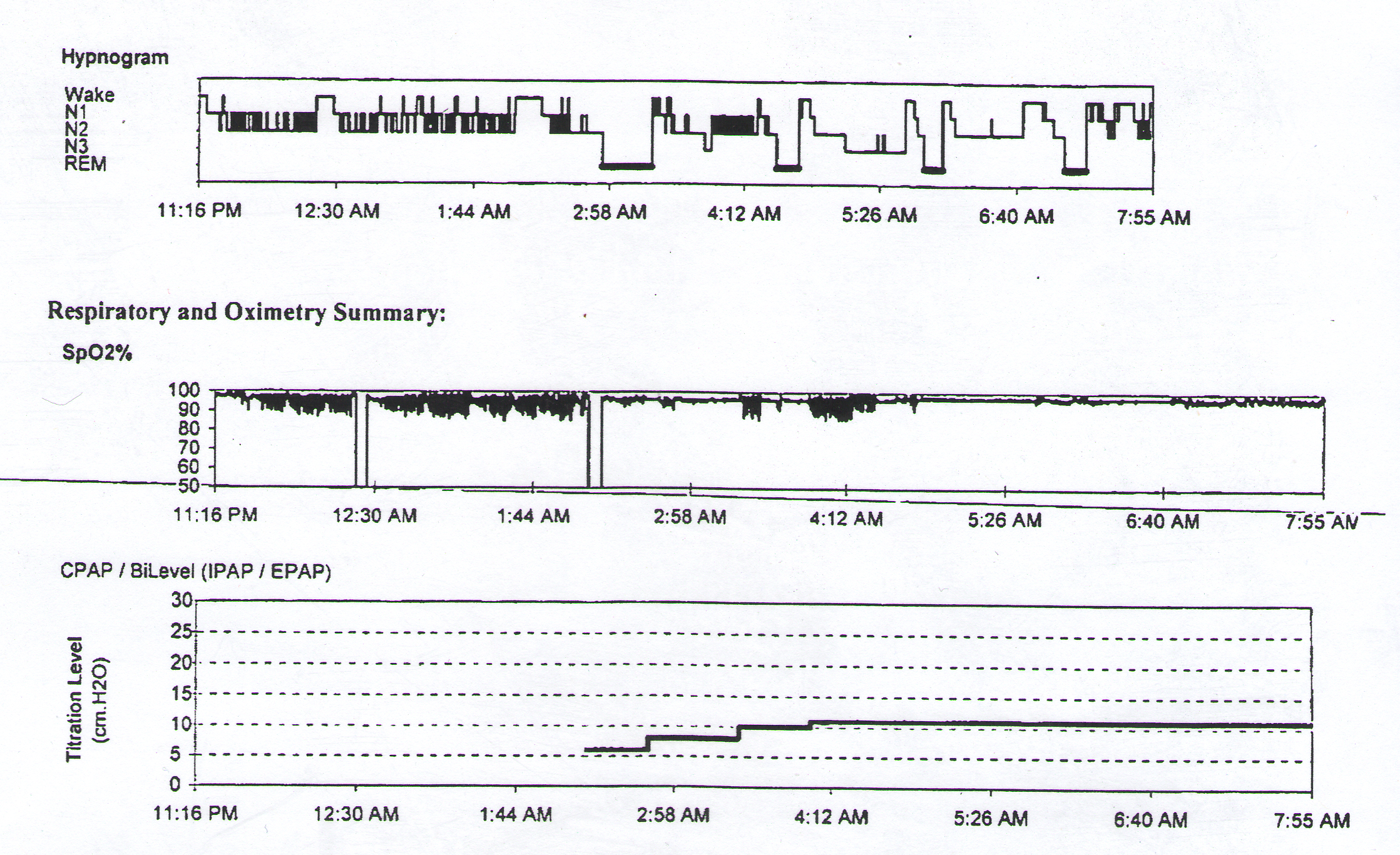
The first graph shows the levels of sleep. You can clearly see the change when I go from the diagnostic phase (no machine) and then tothe titation phase (with machine). I suddenly start going through all the sleep stages, until the last hour when I got fidgety.
This is a summary of the results. The AHI index of 78.9 means that I averaged 78.9 breathing events per hour. Apnea means I stopped breathing, and hypopnea means my breathing was reduced enough to affect my oxygen levels. Those two are added together for this index. Supine means sleeping in my back, so my average goes up when I am sleeping on my back.
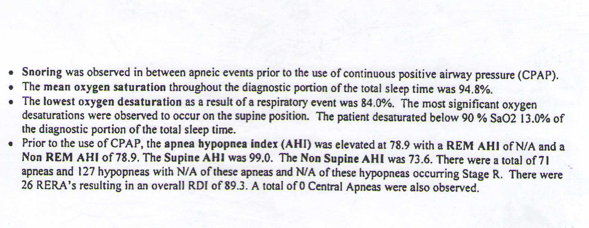
These graphs are from my apap machine. I had to change the time on the machine to get the reports to count these as a normal night. So, when it says I went to bed just before 2am, it was really just before 6am. These graphs are for Wednesday night to Thursday morning.
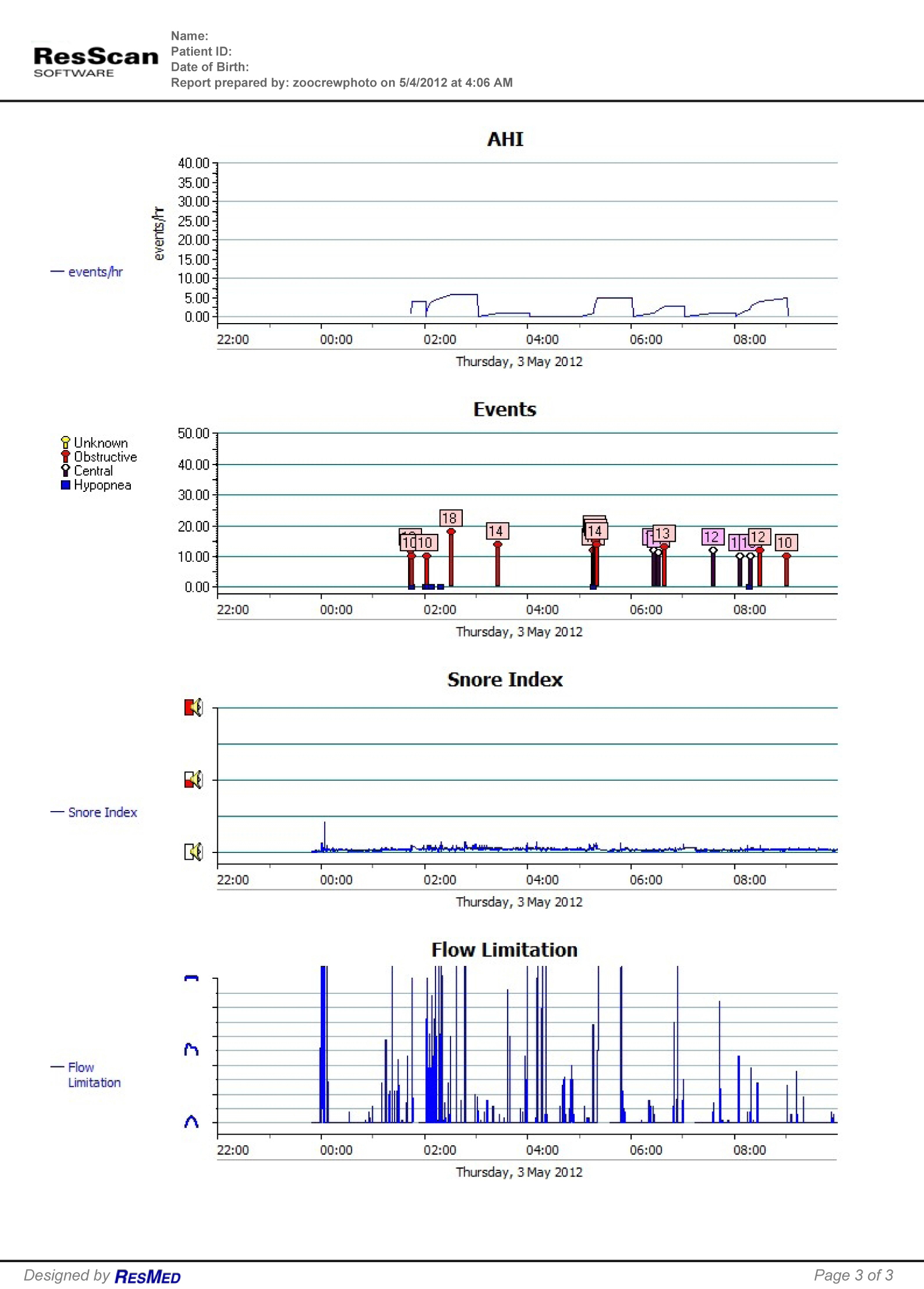
AHI is that index I mentioned above. With the machine, I was having 78.9 breathing problems per hour. This graph shows that I was basically at 6 or less per hour. The next graph shows the actual events that were recorded. The numbers are how long each event lasted in seconds.
Snore index should be obvious.
The Flow limitation chart shows how I am breathing. The symbols on the left refer to open airway (at the bottom), partially blocked airway (middle), and blocked airway (at the top). Ideally, the graph will stay very low. The silly icons themselves are supposed to indicate (from bottom to top): A completely open airway; an airway with some flow limitations (i.e. partially compromised, blocked, obstructed, etc), and a completely closed, collapsed airway. The silly icons themselves are supposed to indicate (from bottom to top): A completely open airway; an airway with some flow limitations (i.e. partially compromised, blocked, obstructed, etc), and a completely closed, collapsed airway.
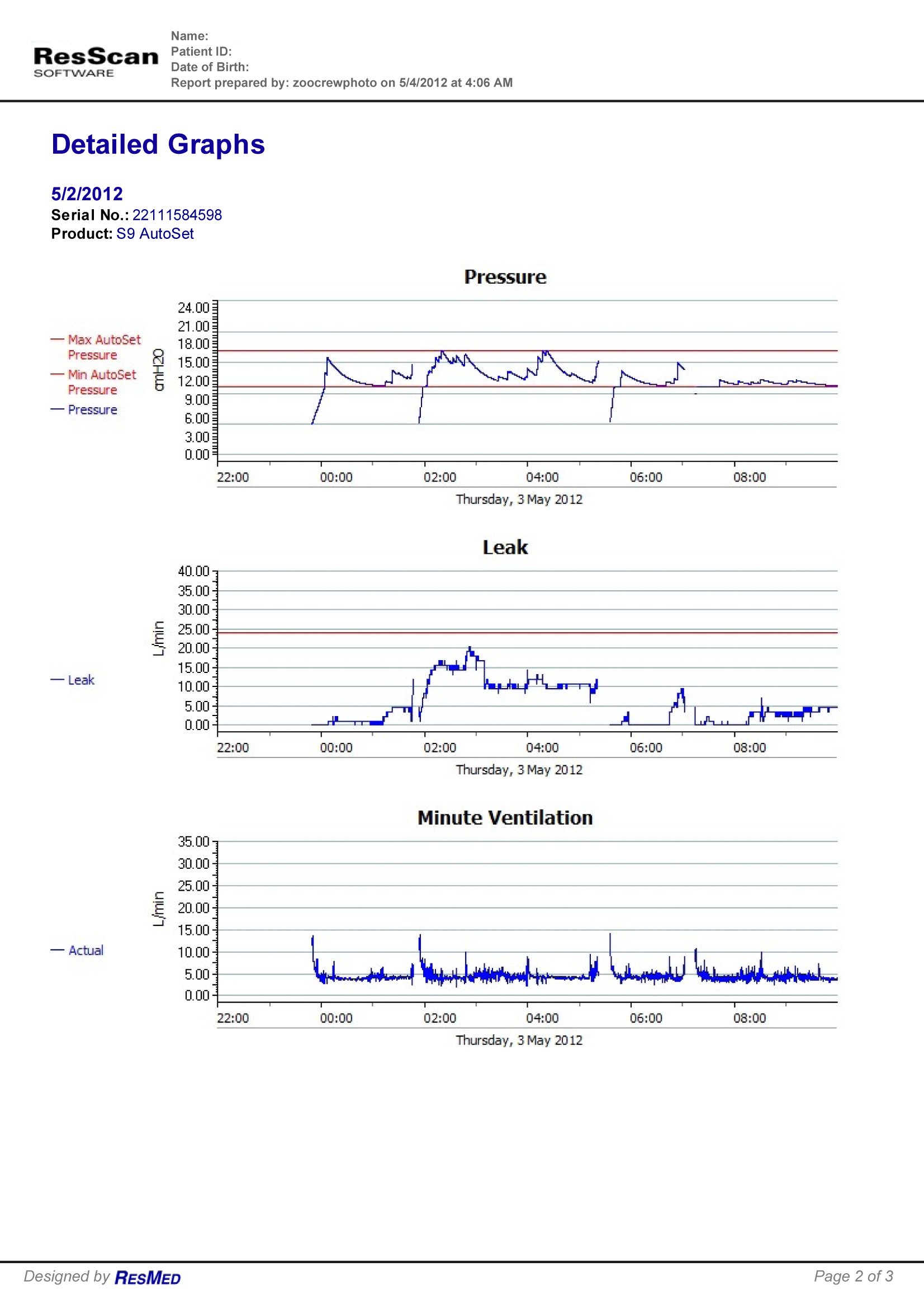
Pressure is the chart that shows what my machine did to help me. It is set for 11-17, so the two red lines are 11 and 17. The 3 lines below the lower red line are when the machine started up at the beginning, and after two trips to the bathroom. The rest of the time, you can see it going up and down as needed.
Leak refers to the amount of air leaking out of my mask. The red line represents the limit where the machine is unhappy with the amount of leak. There will always be some amount of leak, and each machine has a level that is acceptable. At times, when I move, it will go up and down. But it never got bad enough to affect the machine's ability to help me.
Minute Ventilation is the volume of air breathed in (or out) within any 60 second period. A normal rate at rest is 5-8. When exercising, it will be much higher, in the 40-60 range. Looks like I am usually slightly below 5 for a lot of it with deeper breaths part of the time. When I was 19, I was tested for asthma, and I could not pass the lung capacity tests. They thought I wasn't trying, or wasn't doing it right. They even gave me medication. I still couldn't reach the normal rates. They decided that I probably have a smaller aiway than normal for my body size. So, this does not surprise me.